I’ve been agonising over a particular usability issue for weeks, and in the absence of a focus group budget I decided to blog it. Perhaps you can help me form a better opinion on this.
It concerns the presentation and default behaviour of a ‘download’ link. The file could be of any type, but is generally implied to be large. My dilemma is whether to force the file to download, or let the browser handle it. Both seem to have their problems depending on the type of file, but worst of all people seem to be hugely divided over both their preference and their expectation of what will happen by default when they click it.
Of course it’s possible to force any file to download (without your browser attempting to handle it) by setting the appropriate http headers. This can be done with images too, and if you want the user to download a 20MB jpeg then surely you’re not going to want this to open in a browser window, are you? But does everyone know they can right-click and save the large image to disk? I doubt it.
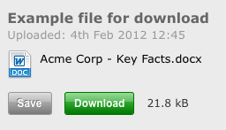
Anyway, being a strong believer that you should never second-guess a user’s intention, and always provide choice in the case of doubt, I’ve ended up with this:

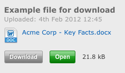
– and previously this:

– and I hate them both.
I hate them because they over-complicate a simple function, and I imagine people saying to themselves “what’s the difference between Save and Download?” etc..
Your thoughts in the comments are most welcome.