Today, I’ve been trying out the alpha version of Qwiki, which was unveiled at Techcrunch Disrupt on Sep 27th.
It’s ambitious technology. Their goal is to “improve the way people experience information” and [even more ambitiously] to “advance information technology to the point it acts human”. These two statements indicate somewhat separate challenges. That first point is largely a delivery problem, the latter keeps Nobel Prize winners awake at night.
On the surface of this noble mission is their initial, public-facing product – Qwiki alpha. This presents itself as an encyclopaedia that recites its copy through a computer-generated voice, while presenting supposedly relevant imagery as it goes. It does this in a way that is visually enjoyable – That’ll be the “experience” part.
I have no doubt that behind this front end is a fabulously complex bit of technology. But in terms of usefulness, we only have this product to go on for the time being.
Gimmick, or progress?
Qwiki prefixed their unveiling with a clip from Wall-E, stating that this is “How Hollywood solves the problem of information overload”.
It feels rather like their current product draws on our knowledge of science fiction to appear futuristic, and therefore superior to the status quo. By their own admission, Qwiki wishes to “shape the future”, but it looks rather like Hollywood has already drafted this particular future, and they’re just trying to make it a reality. Science fiction has been arguably prophetic at times, but I’m not convinced by this one – yet.
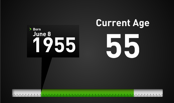 The question in my mind is whether this aspirational way to consume information is actually progress, or whether its aesthetic qualities misleadingly represent its usefulness. Animated (non-functional) maps represent places as they zoom past. Animated bar graphs represent the most basic of statistics, and dates are represented as chunky numbers on a pointless axis.
If you don’t know what time looks like, see image above.
The relevance of photography accompanying the monologue is hit and miss, but this is only a technical challenge. It’s an alpha product after all, so I’ll cut them some slack. My concern is where a purely visual gimmick is used just to make it appear like a useful experience.
Information overload?
I’m not entirely clear on what this information overload problem really is. Or at least it seems we are quite adept at filtering information with the tools we already have. Google brings relevant/important data to the surface through its PageRank algorithm. Whether this is fair all the time, or not, it certainly makes the vastness of the web easier to navigate. I’m not saying there’s no room for improvement, but do we really need artificial intelligence to spoon feed us what it thinks is relevant, without us playing any part whatsoever?
I like the control I have when browsing the web. I may read some text carefully, or I may skim-read. I may glance at accompanying images, or I may seek out better illustrations. I also like to make my own judgement as to whether an information source is valid. I’m not sure I want a computer making all these decisions for me, and I’m not sure I like the information being fed to me so linearly. It seems like a backward step from being a ‘user’ to being a ‘viewer’. Surely the Internet has already empowered us to a greater extent than this.
Perhaps the next generation will be the judge, but I hope we don’t end up the hoverchair-bound, AI-dependent blobs we see in the Wall-E movie.